How to Make Your Website Pop with a Floating Gradient Blob in the Background


Have you ever visited a website and been mesmerized by a beautifully designed background that seems to flow and morph like a floating blob?
If you're looking to add a touch of creativity and uniqueness to your web projects, you might want to consider incorporating a floating blob with gradient colors. In this tutorial, we'll guide you through the process of achieving this effect using HTML and CSS.
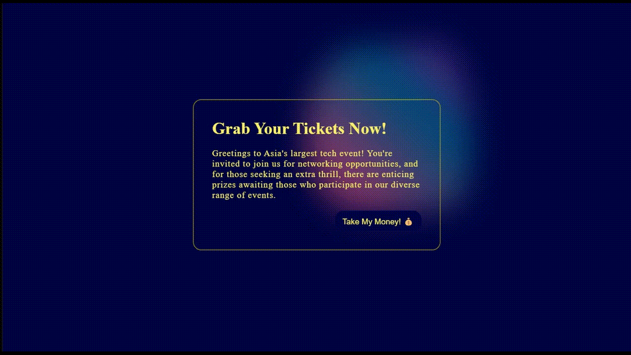
This is the result of what we'll be creating :
1️⃣ Create Blob
Begin by crafting an empty div with the class "blob."
Now, let's shape our blob. While SVG is a common choice, we'll opt for something simpler in this tutorial: border-radius.
border-radius: 60% 40% 30% 70% / 100% 85% 92% 74%;
But what's the '/' in border-radius?

Normally, we specify one value, like border-top-right-radius: 10px;. However, you can define both horizontal and vertical radii for any side. For instance, with border-top-right-radius: 10px 20px;, where 10px is the horizontal radii and 20px is the vertical one.
Short and sweet - when we use border-radius: 60% 40% 30% 70%, it starts from the top-left and moves clockwise. We use percentages because they make it easier to create blobs than pixels.
Now, breaking down:
border-radius: 60% 40% 30% 70% / 100% 85% 92% 74%;
This translates to:
border-top-left-radius: 60% 100%;
border-top-right-radius: 40% 85%;
border-bottom-right-radius: 30% 92%;
border-bottom-left-radius: 70% 74%;
Check out this tool to create different shapes of blobs using border-radius.
2️⃣ Style the Blob
Give your blob some life by adding background color, width, and height:
Use this tool to create beautiful CSS gradients.
.blob {
    ...
    background: linear-gradient(47deg, rgba(255,88,139,1) 21%,  rgb(0 164 173) 67%, rgba(118,74,166,1) 81%);
    width: 400px;
    height: 400px;
}
(Optional): Spice things up with more colors and shapes using box-shadow with inset:
.blob {
    ...
    box-shadow: inset 50px 50px 17px 0px #ff588b,
                inset 100px 100px 17px 0px #66319f;
}
Let's tone it down a notch. Apply some blur, reduce opacity, and push it to the background with a negative z-index:
.blob {
    ...
    opacity: 0.5;
    filter: blur(40px);
    z-index: -1;
}
Animate the Blob 🕺🏿
Time to make it dance! Animate with translate, scale, and rotate. Don't forget to animate the border-radius too, so the blob keeps morphing. Use position: absolute for the blob and position: relative for the parent div.
.blob {
    ...
    animation: animate 20s cubic-bezier(0.68, -0.55, 0.27, 1.55)
               infinite alternate forwards;
}

@keyframes animate {
  0% {
    transform: translate(40%, -25%);
    border-radius: 60% 40% 30% 70% / 100% 85% 92% 74%;
  }
  50% {
    transform: translate(0%, 13%);
    border-radius: 20% 71% 47% 70% / 81% 15% 22% 54%;
    rotate: 41deg;
    scale: 1.15;
  }
  100% {
    transform: translate(-45%, 39%);
    border-radius: 100% 75% 92% 74% / 60% 80% 30% 70%;
    rotate: -60deg;
    scale: 1.05;
  }
}
🌟 Finishing Up 🌟
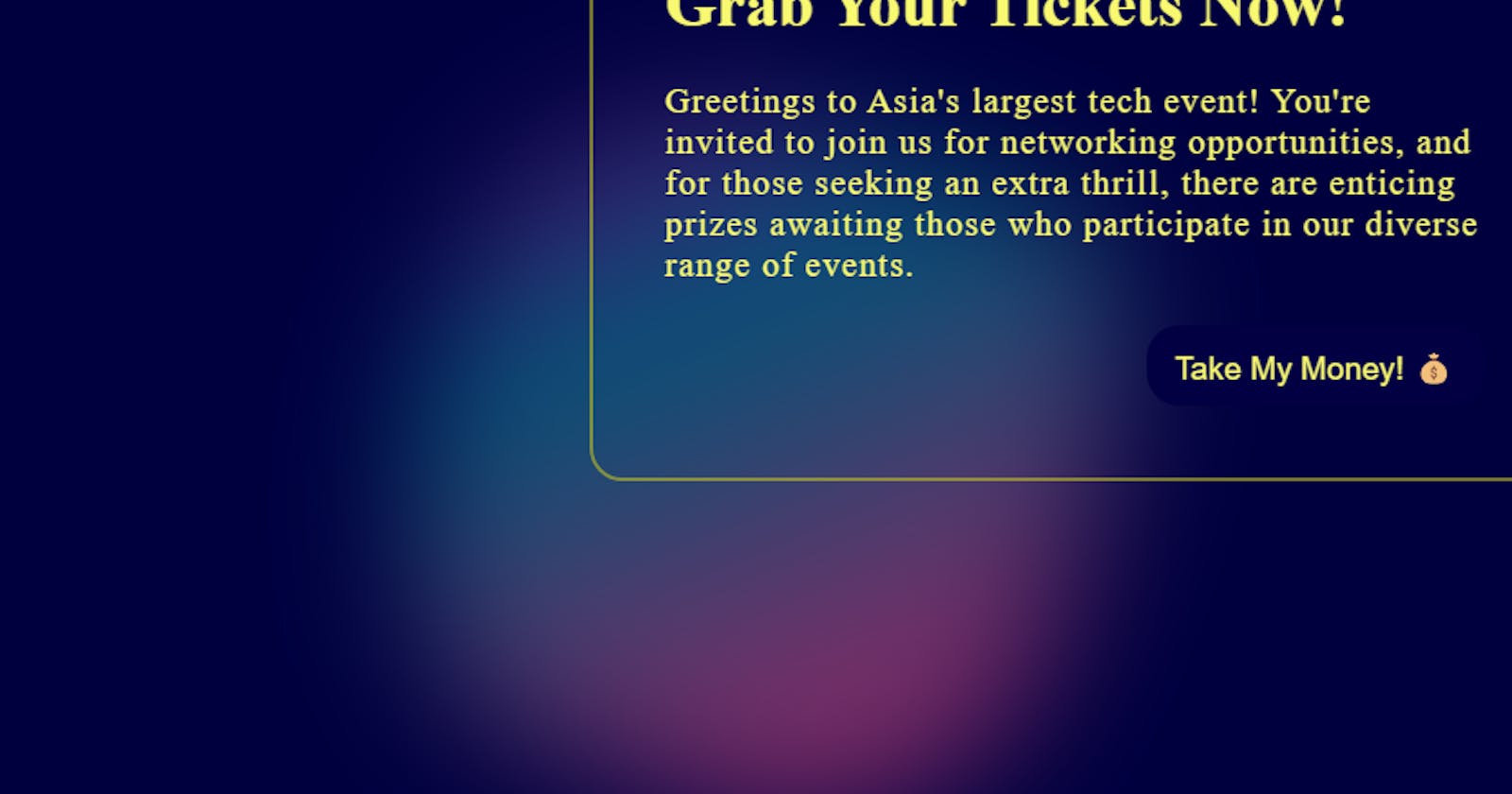
For the finishing touch, you can add your content on top of the blob to create a captivating final product.
And voila! You've got yourself a dynamic, eye-catching blob. Enjoy the creative process!